10 |
Klinisk Biokemi i Norden · 1 2017
it (
co
Ex
of high
Raw data
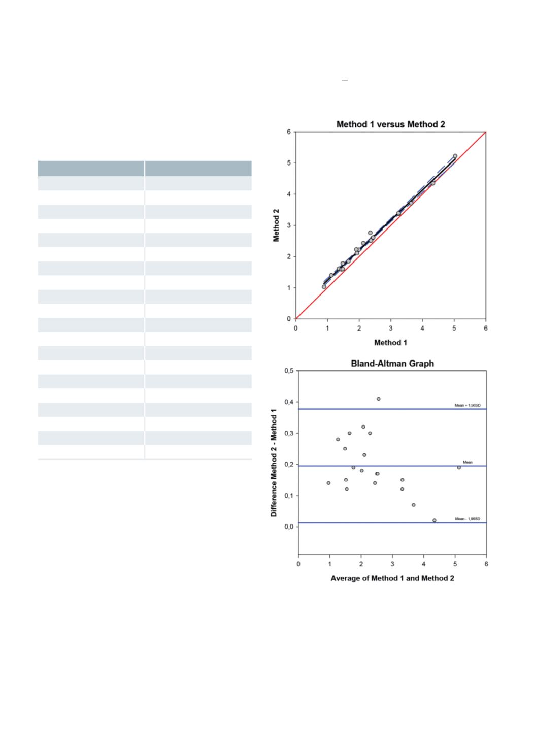
The raw data used in the current example are listed
below
Method 1
Method 2
1,99
2,22
5,03
5,22
1,48
1,78
2,35
2,76
3,25
3,37
3,24
3,39
2,13
2,43
1,12
1,4
1,93
2,11
1,91
2,23
1,36
1,61
0,89
1,03
1,44
1,59
1,66
1,85
2,42
2,59
3,64
3,71
2,44
2,61
1,48
1,6
2,37
2,51
4,33
4,35
Bias plot = Bland-Altman plot
The main purpose of the bias/Bland-Altman graph is
to facilitate the graphical interpretation of the data by
showing an expanded view of the distribution of the
differences between the measurement methods along
the entire plotting space. An advantage of the bias/
Bland-Altman graph compared to common linear
regression is that it uses the entire space available in
the graph to illustrate the differences found. In the
ordinary linear regression depicted above, most of the
space available for the graph is blank since the two
methods normally show very similar results distribu-
ted along the equal line. The mean of the differences
should also be calculated. Optionally the mean dif-
ference for each quartile of the data may be calculated
to express proportional error and also the “limits of
agreement” for the difference data – the mean of the
difference (bias) + 1.96 * standard deviation of the
difference (24, 25, 28-30). In Figure 2, the confidence
limits are also provided.
Figure 2
: Bias/Bland-Altman plot (SigmaPlot 12.5) used for
summarizing the bias when comparing two measurement
methods. The upper graph is an ordinary linear regression
which also depicts the equal line in red. The lower graph is
the bias/Bland-Altman plot proper which shows the diffe-
rence between the two measurement methods on the Y-axis
and the average of the measurement results of the two met-
hods depicted on the X-axis.


